Most product screens are not bespoke. They are lists, cards, forms, buttons, and headers arranged in different orders. A team that ships the same screen to web, iOS, and Android is not maintaining three UIs, it is maintaining one UI three times. Server-driven UI (SDUI) removes that duplication by describing the screen as data, usually JSON, and letting each client render it with native components.
The pattern is not theoretical. Airbnb runs search, listing pages, and checkout on it. Lyft, Spotify, and DoorDash have shipped variants of it. The trade-offs are well mapped, and so are the failure modes.
Three ways to ship the same screen everywhere
Cross-platform UI has three broad strategies, and they fail in different places.
- Webviews. One HTML implementation rendered inside every app. Cheap to build, but scrolling, gestures, and accessibility never feel native, and performance is capped by the embedded browser.
- Shared code (React Native, Flutter). One codebase compiled for each platform. Solves duplication, but every UI change still ships as code, which means an app store release and a review cycle for a layout tweak.
- Server-driven UI. The client ships a registry of native components. The server sends a description of the screen. UI changes are data changes, live the moment the server deploys.
The third option is the only one where the deploy unit for a UI change is a server response rather than a binary.
The mechanism is a component registry plus a tree of data
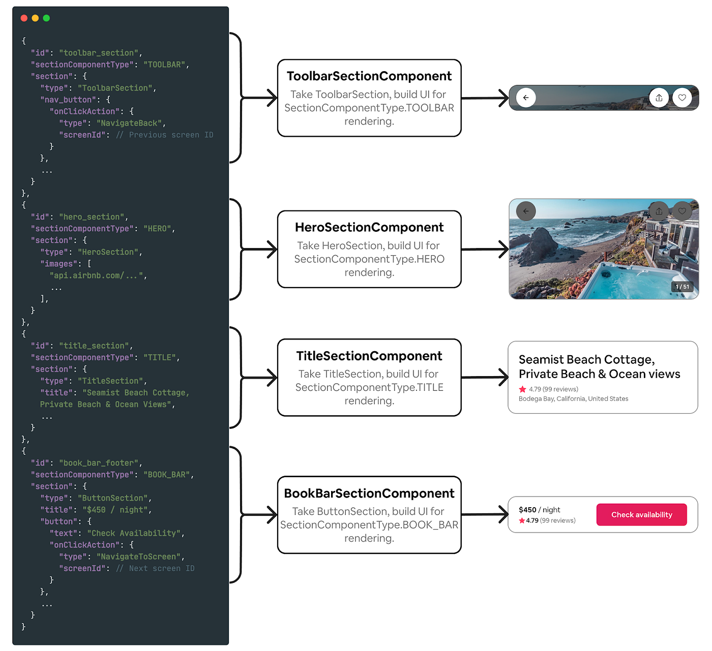
An SDUI client does two things. It registers native implementations for a closed set of component types, and it walks a server-provided tree, mapping each node to the registered implementation.
The server is the single author. Each client owns nothing but the mapping from type names to native views.
A minimal payload looks like this:
The renderer is a lookup and a recursion:
The same tree drives a SwiftUI registry on iOS and a Compose registry on Android. Every widget on screen is a real native view: native scrolling, native gestures, native accessibility. This is the property webviews cannot offer and the reason SDUI is mostly a mobile pattern.
The renderFallback branch is load-bearing. Old clients will receive component types they do not know. A production SDUI system defines what happens then: skip the node, render a server-provided fallback, or prompt an upgrade. Microsoft's Adaptive Cards, the same idea applied to Teams and Outlook, bakes fallback elements directly into the schema for exactly this reason.
How Airbnb structures it: the Ghost Platform
Airbnb's Ghost Platform (named for Guest and Host, the two sides of the product) is the most instructive public write-up, because it shows what the pattern needs at scale.
One schema, three platforms. The screen description lives in a single shared GraphQL schema that generates strongly typed models for TypeScript, Swift, and Kotlin. The clients cannot drift, because they are consuming the same types.
Sections are the unit, screens are the arrangement. A section is a self-contained group of components with pre-formatted, localized data, independent of any screen. A screen arranges sections through layout definitions, with separate layouts per form factor so the same sections reflow between compact and wide breakpoints. Reuse happens at the section level: a section built for search can appear on a listing page without either screen knowing about the other.
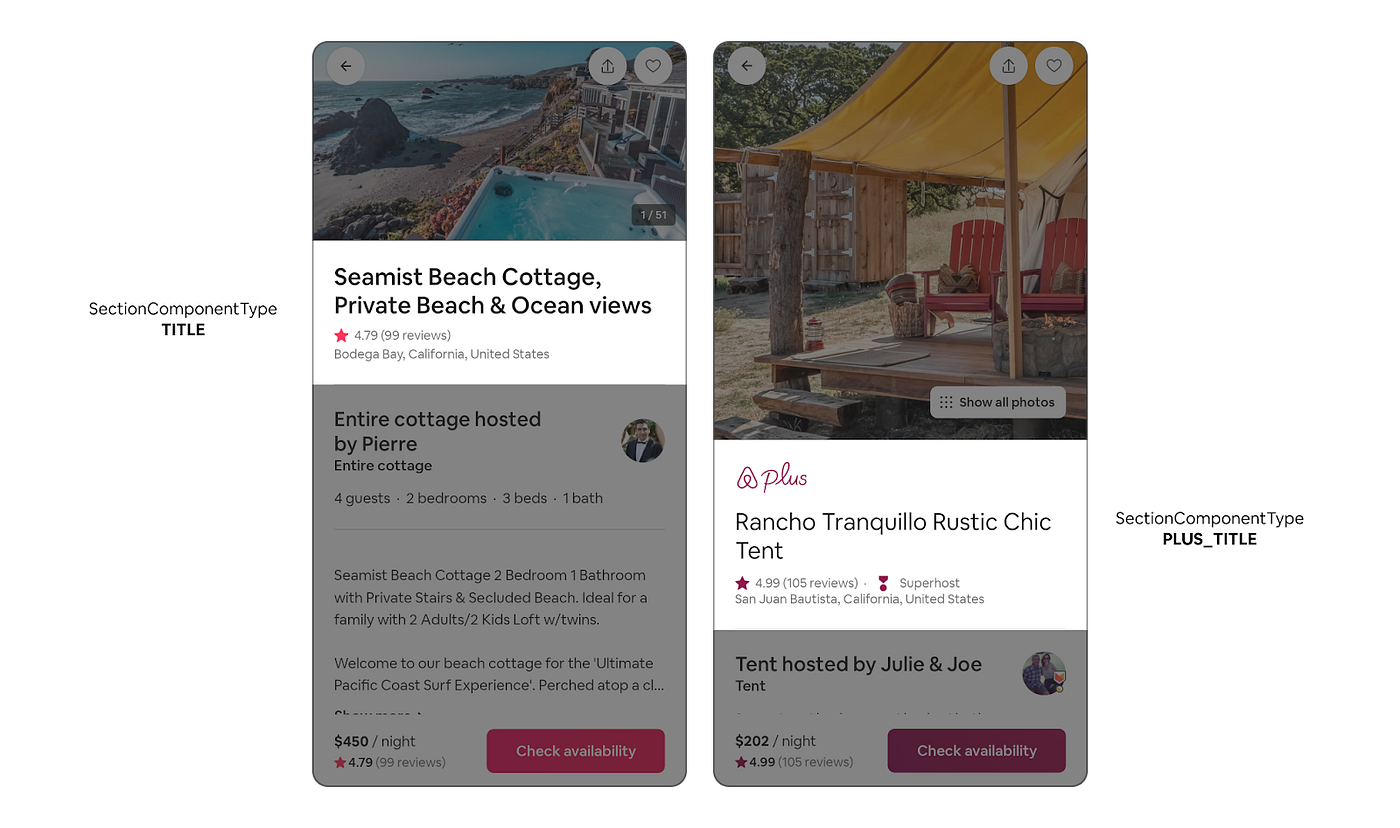
Rendering style is a parameter, not a new type. A section carries a SectionComponentType that selects how it renders. The same TitleSection data can render as a plain title or a branded variant without a new data model. This keeps the component set small while the visual vocabulary grows.
Interactions are data too. User events fire server-defined actions through an IAction interface. Navigation and other generic actions are handled by the framework on every platform; feature-specific actions route to scoped handlers. The server controls not just what a screen shows but what tapping it does.
Within a year of introduction, the majority of Airbnb's most used surfaces ran on it. That is the strongest available evidence that describing UI as data holds up beyond internal tools and settings screens.
The app store is where SDUI pays off most
Apple and Google prohibit shipping new executable code outside the store review process. They do not prohibit shipping data. An SDUI client was reviewed once, with its full component registry; the JSON that arranges those components is content, the same way an article or a product listing is content.
The practical boundary follows directly from that rule. New arrangements of existing components deploy instantly from the server. New component types still require an app release, because the native implementation has to ship in the binary. Teams running SDUI therefore invest heavily in making the registry general: the more expressive the closed set of components, the more of the product can change without touching the stores.
This inverts the usual mobile release calculus. A layout experiment, a reordered checkout flow, or a killed feature no longer waits one to two weeks for review plus user adoption of the update. It waits for a server deploy.
Where the pattern breaks
SDUI has a well-known failure mode: the schema grows into a bad programming language. It starts with a visible flag, then a condition on the flag, then a loop over items, and eventually the team has reinvented conditionals, iteration, and state management in JSON, with no type checker, no debugger, and no tests.
The teams that avoid this hold two lines:
- Logic stays on the server. The client receives the result of decisions, never the inputs to them. If a section should be hidden for some users, the server omits it. The payload contains no conditions to evaluate.
- The component set stays closed and small. Every new component type is a permanent liability across three platforms. The bar for adding one should be high, and the pressure to add one is usually a sign the screen is too bespoke for SDUI in the first place.
The second point defines the pattern's honest scope. SDUI covers the large fraction of a product that is composition: feeds, settings, forms, detail pages, checkout steps. It is the wrong tool for a map, a calendar with drag interactions, or a media editor. Production systems handle those as escape hatches, single opaque components that are fully client-implemented and merely placed by the server.
Versioning is the other permanent tax. Server responses must render acceptably on every client version still in the field, which means fallback behavior is designed up front, payloads are validated against the oldest supported schema, and removing a component type takes as long as the slowest user upgrades.
Where to start
The adoption path that works starts where the stakes are low and the screens are boring:
- Internal tools and admin panels. Nearly pure CRUD, no app store involved, immediate payoff from not rebuilding forms.
- Settings and profile screens. High composition, low interactivity, frequent small changes.
- Feeds and content-driven pages. The place SDUI shines, because the server already decides what appears; letting it decide how is a small step.
Flagship interactive screens come last or never. The pattern earns trust on the surfaces where UI genuinely is data, and most products have far more of those surfaces than their five parallel implementations suggest.
The principle underneath is older than any of these systems: when many artifacts vary only in structure, stop writing the artifacts and start writing the description. Screens built from a fixed component vocabulary are such artifacts. Describe them once, render them everywhere.